

Onboarding in an Electric Car Rental App
My role:
UI/UX Designer & Project Manager | Consultant via Axakon
Period:
2022
How a strong visual identity can benefit even more from clearer structure and fewer decisions.
Mobile Application
Onboarding
UI teardown
Elbilio
Context & Starting Point
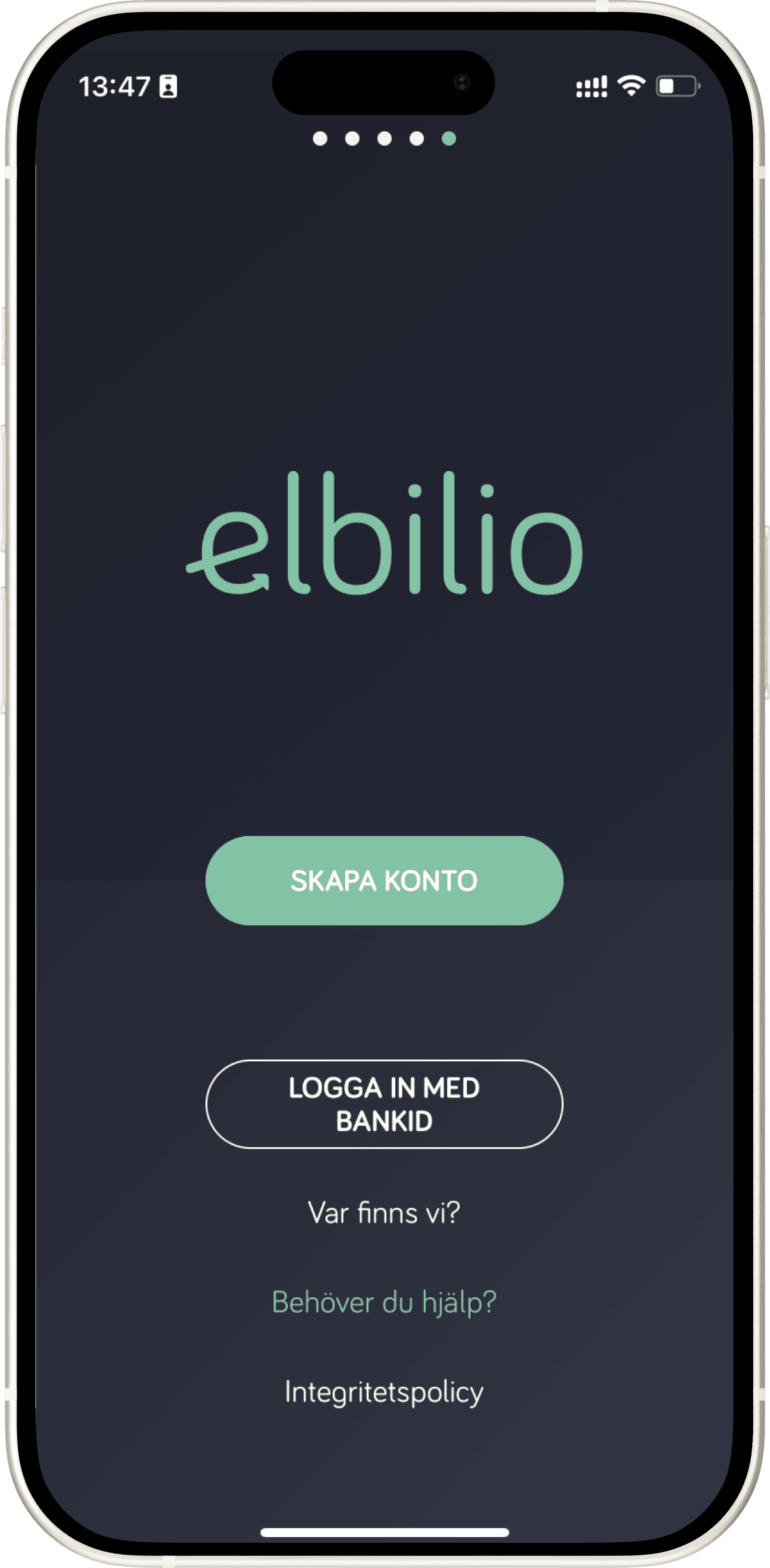
This is the onboarding and the initial steps in an electric car rental app.
The user is new and needs to understand how the service works and determine if the experience feels straightforward enough for everyday use.
The starting point was not to redesign the product, but to analyse the existing experience:
what already worked well, where friction occurred – and how minor adjustments could make the flow clearer without losing identity.

My work process: the initial analysis
Design of Three Systems I designed three distinct yet interconnected solutions:
Mobile and web app for customers – to order towing services and monitor the process in real-time.
Tablet app for towing operators – similar to the Uber driver app, to receive tasks and navigate.
Administrative system (desktop) – for overseeing active towing operators, ongoing cases, and logistics across Sweden.
Project Management
Led three separate development teams (a total of nine developers).
Responsible for follow-ups, estimations, sprint planning, and delivery to the customer.
Ensured communication between the customer, developers, and internal stakeholders.
UX & UI Design
Developed user flows for three different target groups (customer, towing operator, administrator).
Designed clear interfaces focusing on simplicity, quick understanding, and reliability in critical situations.
Created a cohesive visual language across all three systems.
Strengths & Friction
There was a clear foundation to build upon, but also tangible issues impacting the experience.
Strengths:
A well-developed visual identity with a distinct character
Colour choices and tonality that signalled modernity and sustainable mobility
An ambition to create a premium feel from the very first interaction
Friction:
Too many choices presented early in the flow
Primary and secondary actions visually competed with each other
Limited use of whitespace affected readability and focus
Some important features required more interpretation than necessary
In an initial phase where users seek security and simplicity, the experience became more demanding than necessary.
Principle, direction & next steps
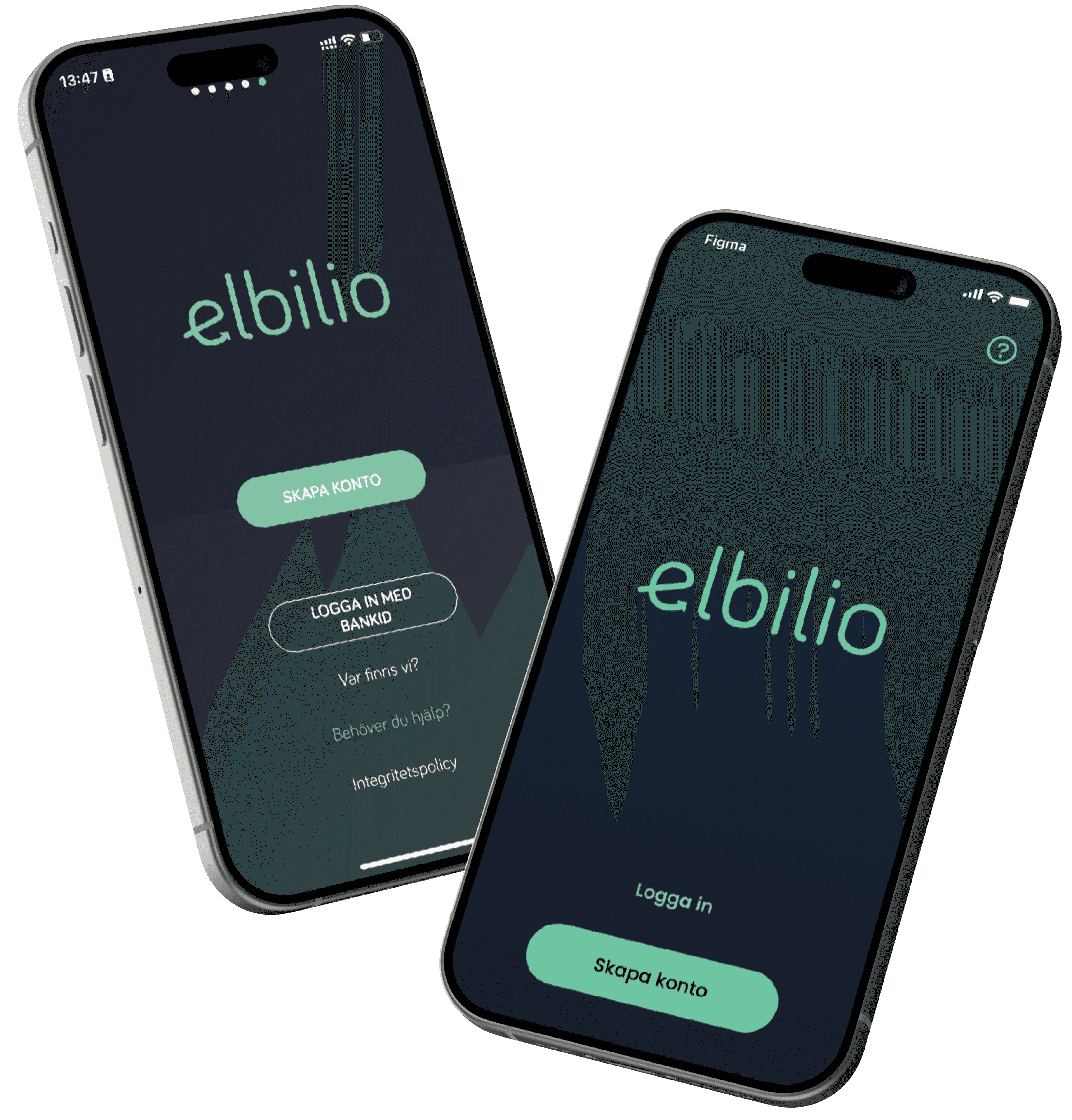
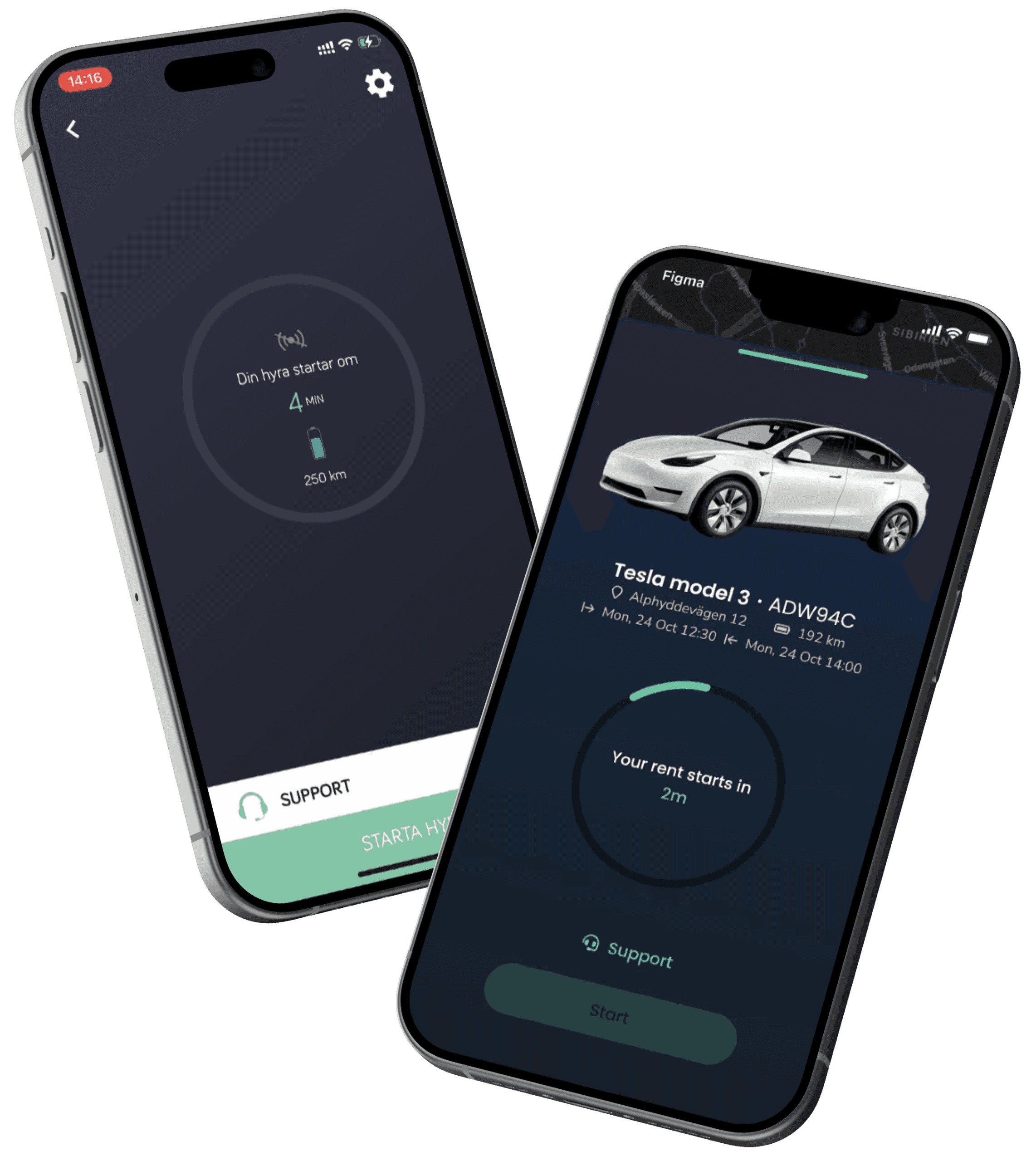
The aim of the proposal was not to alter the product’s identity, but to more clearly align the visual expression with the actual user experience.
By reducing the number of choices per view, clarifying the hierarchy, and creating a better rhythm between information and action, the same product can feel both more calming and intuitive to use.
For me, this type of work is about respect:
for what is already accepted, for previous decisions, and for ensuring improvements genuinely feel like enhancements – not like a new system.
Therefore, the proposal was developed as a discussion document, something the team could use as a common reference for the next steps.

Onboarding in an Electric Car Rental App
My role:
UI/UX Designer & Project Manager | Consultant via Axakon
Period:
2022
How a strong visual identity can benefit even more from clearer structure and fewer decisions.
Mobile Application
Onboarding
UI teardown
Elbilio

Context & Starting Point
This is the onboarding and the initial steps in an electric car rental app.
The user is new and needs to understand how the service works and determine if the experience feels straightforward enough for everyday use.
The starting point was not to redesign the product, but to analyse the existing experience:
what already worked well, where friction occurred – and how minor adjustments could make the flow clearer without losing identity.

My work process: the initial analysis
Design of Three Systems I designed three distinct yet interconnected solutions:
Mobile and web app for customers – to order towing services and monitor the process in real-time.
Tablet app for towing operators – similar to the Uber driver app, to receive tasks and navigate.
Administrative system (desktop) – for overseeing active towing operators, ongoing cases, and logistics across Sweden.
Project Management
Led three separate development teams (a total of nine developers).
Responsible for follow-ups, estimations, sprint planning, and delivery to the customer.
Ensured communication between the customer, developers, and internal stakeholders.
UX & UI Design
Developed user flows for three different target groups (customer, towing operator, administrator).
Designed clear interfaces focusing on simplicity, quick understanding, and reliability in critical situations.
Created a cohesive visual language across all three systems.
Strengths & Friction
There was a clear foundation to build upon, but also tangible issues impacting the experience.
Strengths:
A well-developed visual identity with a distinct character
Colour choices and tonality that signalled modernity and sustainable mobility
An ambition to create a premium feel from the very first interaction
Friction:
Too many choices presented early in the flow
Primary and secondary actions visually competed with each other
Limited use of whitespace affected readability and focus
Some important features required more interpretation than necessary
In an initial phase where users seek security and simplicity, the experience became more demanding than necessary.


Principle, direction & next steps
The aim of the proposal was not to alter the product’s identity, but to more clearly align the visual expression with the actual user experience.
By reducing the number of choices per view, clarifying the hierarchy, and creating a better rhythm between information and action, the same product can feel both more calming and intuitive to use.
For me, this type of work is about respect:
for what is already accepted, for previous decisions, and for ensuring improvements genuinely feel like enhancements – not like a new system.
Therefore, the proposal was developed as a discussion document, something the team could use as a common reference for the next steps.

Onboarding in an Electric Car Rental App
My role:
UI/UX Designer & Project Manager | Consultant via Axakon
Period:
2022
How a strong visual identity can benefit even more from clearer structure and fewer decisions.
Mobile Application
Onboarding
UI teardown
Elbilio

Context & Starting Point
This is the onboarding and the initial steps in an electric car rental app.
The user is new and needs to understand how the service works and determine if the experience feels straightforward enough for everyday use.
The starting point was not to redesign the product, but to analyse the existing experience:
what already worked well, where friction occurred – and how minor adjustments could make the flow clearer without losing identity.

My work process: the initial analysis
Design of Three Systems I designed three distinct yet interconnected solutions:
Mobile and web app for customers – to order towing services and monitor the process in real-time.
Tablet app for towing operators – similar to the Uber driver app, to receive tasks and navigate.
Administrative system (desktop) – for overseeing active towing operators, ongoing cases, and logistics across Sweden.
Project Management
Led three separate development teams (a total of nine developers).
Responsible for follow-ups, estimations, sprint planning, and delivery to the customer.
Ensured communication between the customer, developers, and internal stakeholders.
UX & UI Design
Developed user flows for three different target groups (customer, towing operator, administrator).
Designed clear interfaces focusing on simplicity, quick understanding, and reliability in critical situations.
Created a cohesive visual language across all three systems.
Strengths & Friction
There was a clear foundation to build upon, but also tangible issues impacting the experience.
Strengths:
A well-developed visual identity with a distinct character
Colour choices and tonality that signalled modernity and sustainable mobility
An ambition to create a premium feel from the very first interaction
Friction:
Too many choices presented early in the flow
Primary and secondary actions visually competed with each other
Limited use of whitespace affected readability and focus
Some important features required more interpretation than necessary
In an initial phase where users seek security and simplicity, the experience became more demanding than necessary.


Principle, direction & next steps
The aim of the proposal was not to alter the product’s identity, but to more clearly align the visual expression with the actual user experience.
By reducing the number of choices per view, clarifying the hierarchy, and creating a better rhythm between information and action, the same product can feel both more calming and intuitive to use.
For me, this type of work is about respect:
for what is already accepted, for previous decisions, and for ensuring improvements genuinely feel like enhancements – not like a new system.
Therefore, the proposal was developed as a discussion document, something the team could use as a common reference for the next steps.

